Incorporate Dark Mode in Gatsby
Created on July 23, 2019
By Fahad Hussain
Why we should use dark mode
As someone who stares at the monitor all day long, I personally know how much it can tax your eyes out, especially when viewing a giant white screen for an extended period of time. And that is why I have my code editor, Visual Studios, in dark mode. I would go crazy if there were no dark mode for Visual Studio. But I know not everyone is like me and there are actually some programmers out there that prefer the white brightness of the screen on their editors. But at least we have that option to switch between light mode and dark mode in code editors. Since there is that option, there must also be an option to switch between light mode and dark mode for webpages. And there is, and the best part is, we can build it. We can provide that luxury for our users when building out webpages.
Hence, I'll go over on how to incorporate dark mode to your webpage so that you can provide that sort of luxury to your users. I'll be using Gatsby.js to incorporate dark mode so if you're not familiar with that framework, well now it's your chance.
As a brief overview, I'll quickly go over what Gatsby.js is. Gatsby.js is a free and open source static site generator. A modern front-end framework that leverages React and is powered by GraphQL to help developers build blazing fast websites. For more information, just visit the Gatsby.js website to look through all the documentations they have, the types of plugins (we'll be using a few later on) it has to offer, tutorials, and so much more. For the purpose of incorporating dark mode, we don't necessarily have to dive that deep into Gatsby.js, just knowing a few terms will help you get to the goal. So without further ado, let's get started!

Prerequisites
To be able to continue along with the steps below, you must have some familiarity with the Command Line Interface (CLI) and have Node.js installed. To check what version of Node you have just type this line of code on your terminal:
node --version
Update to the latest version if you don't have already. And from there, let's start with the first step.
Quick Start
1.) Install the Gatsby CLI
This allows you to run commands when working with Gatsby.js. Commands that can be used to run the Gatsby server and prepare for deployment. Install it globally with this command in the CLI:
npm install -g gatsby-cli
2.) Create a Gatsby Site
Now that you have globally installed the Gatsby CLI, we can run a command to build a Gatsby site. To create a new Gatsby site, run this command:
gatsby new dark-mode-project
You don't have to name your project "dark-mode-project", you can name it whatever you want as long as you give it a name. But for this example I'll be calling it "dark-mode-project". Now that you have created your gatsby project, change directory into that folder.
3.) Run the Server
If you want to see what your new project looks, just run this command in the terminal:
gatsby develop
Again, you must be in the folder you have just created for this command to work. Once you ran that command, go to your browser and visit http://localhost:8000. This is the default url when creating new gatsby sites.

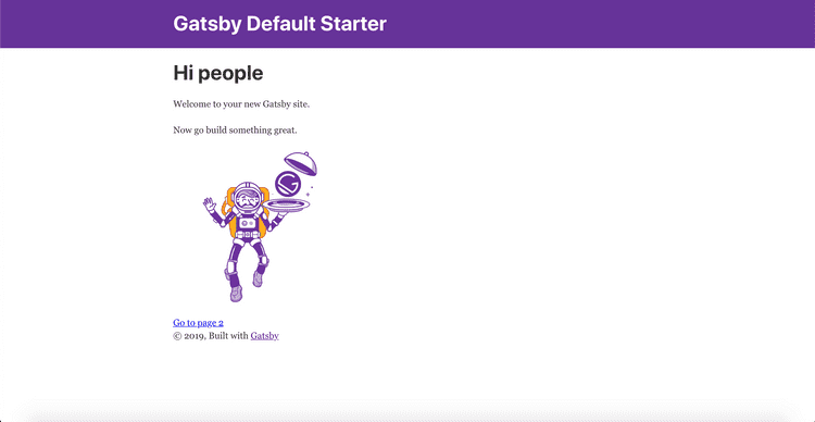
When you visit the default url for the new gatsby site, you will see a page that looks like the one above. We won't really be changing much on this page except for adding a toggle switch in the navbar. If you would like to make any additional changes to the look of this page throughout this tutorial, then feel free to do so. Well, I hope you do because to goal of this tutorial is for you to incorporate it in your personal webpages.
Install Dark Mode and Sass
4.) Install Dark Mode
Remember how I mentioned earlier in the intro that we'll be using plugins later on? Well now it's time. Head over to the Gatsby website and click on the Plugins link on the navbar. Here we can look for all sorts of plugins that we can incorporate into our gatsby site. Feel free to look for certain plugins that you think will go well for your site but the one of interest we're going to use is called
the gatsby-plugin-use-dark-mode.
In your terminal, head over to the gatsby project directory if you're not there already and run the following code:
npm install gatsby-plugin-use-dark-mode use-dark-mode
Since we will be creating a toggle switch later, we need to style it for it to be fully functional or at least make it look fully functional. So next we will install Sass.
4.) Install Sass
Gatsby has a plugin for Sass so lets install that with this command on the terminal
npm install --save node-sass gatsby-plugin-sass
This plugin will allow us to use the extension SCSS when creating files. But not just yet, there is an important step we have to do next before we can really do that. And it's a step that's needed whenever we install a plugin. So we'll be doing this for the use dark mode plugin.
5.) Configure the Gatsby plugins
Once you have installed both plugins, you'll want to include them in your gatsby-config.js file. This file may look intimidating at first but I can assure you that it is very easy to work with. And very quickly you'll become comfortable with this file and with installing plugins. To include the two plugins we have installed, within the module.exports bracket, write down plugins, set it as an array and within that array, put the name of the plugins we installed. Here's an example:
plugins: [
`gatsby-plugin-use-dark-mode`,
`gatsby-plugin-sass`,
]
If you want to include other plugins, just write them down after the comma. You won't have to create a plugins array again, unless you need plugins within a plugin. But you don't have to worry about that for now. Once you get that part done, we can move forward to the next step, and that's implementing dark mode and sass.
Creating a DarkMode JS and Toggle JS file
In gatsby, there is a folder called pages. Do not create a file in the pages folder unless you plan on creating another page. The cool thing about Gatsby.js is that when you create a javascript file or component in the pages folder, that component automatically becomes a page with a path based on its file name.
Another cool thing about Gatsby.js is that a component folder is already made for you with some pre-existing files. So within that components folder, we will create the two JavaScript files we need.
6.) Create a DarkMode.js file template
Under the components folder, create a file called DarkMode.js or whatever you want to call it. Just like with any react components, put in a template, preferably a function component template. We don't need a class component template because we won't be needing the constructor or be using state or setState. As for the name of the function, I'll be calling it DarkMode.
7.) Writing the code in the DarkMode.js file
Now that you have your starter template, lets start off first my importing from the use-dark-mode plugin we installed. To do that we just import it like we would with any other files or extensions. Below the import React line of code, put in this:
import useDarkMode from "use-dark-mode"
You don't necessarily have to call it useDarkMode, you can call it whatever you want. As long as it is importing from "use-dark-mode", you'll be fine. Within the DarkMode function, you want to grab that variable that you set it to import, useDarkMode and give it a parameter of false. Then set that equal to a variable, which we'll be calling a few times. Here's an example of how to do that:
const darkMode = useDarkMode(false)
Within the div of the DarkMode function, lets give it a class name of "toggle-icons" so that we can call that class name to style later. Within that div we're going to have 2 buttons. One button will have the picture of the sun and the other button will have the picture of the moon. This will let users know if they're in dark mode or in light mode if it's not already obvious from the color of the screen. It will also provide an aesthetic look to the webpage. Also both buttons will have an onclick function. Because we will currently be in light mode, we will set the darkMode to disable, meaning that button will not work. For the other button with the moon shape, we will set darkMode to enable so that we can switch to it from light mode.
Within the two buttons, we will call the Toggle.js file. We have yet to create that file, but we will in a moment. When we call that Toggle.js file, we want to pass in two datas as props. First is the value of darkMode and the second is toggle. The value represents true or false, currently we set it as false so the view of the screen will be in light mode. The toggle represents the function of dark mode. We can choose the name of the props and in my case I named it "checked" for the darkMode value and "onChange" for the darkMode toggle. Before we are all done with this file, let's import the Toggle.js file, import Toggle from './Toggle'. After you've gone through that, this is what your code should look like:
import React from "react"
import useDarkMode from "use-dark-mode"


const DarkModeToggle = () => {
  const darkMode = useDarkMode(false);

  return (
    <div className='toggle-icons'>
      <button id='sun' type="button" onClick={darkMode.disable}>
        ☀
      </button>
      <Toggle checked={darkMode.value} onChange={darkMode.toggle} />
      <button id='moon' type="button" onClick={darkMode.enable}>
        ☾
      </button>
    </div>
  );
};

export default DarkModeToggle
8.) Writing the code in the Toggle.js file
Within the components folder where you created the DarkMode.js file, create the Toggle.js file. In the this file is where you'll use the props passed down from the DarkMode.js file. You will also create the toggle switcher that will move back and forth from the sun icon and moon icon buttons we just created earlier. We will also make this into a functional component and I'll name the function to Toggle. Within the parameters of the function, we want to grab the props from the DarkMode.js file, which in my case are "checked" and "onChange". Then within the body of the function we want to explicitly return span with a class name of "toggle-control" We will style this along with the input tag that we will create and nest within the span tag.
The styling of both the span and input tag will show us a toggle bar to view the distance between the sun icon to the moon icon and vice versa. Then with the label tag which we will create within the span tag will represent the actual lever that will sit on top of the toggle bar and will move back and forth to the sun icon and moon icon. All this is for aesthetic purposes so it's not really needed but it is visually appealing so I do suggest you put it in and make adjustments of styling afterwards.
When you have created the input tag within the span tag, you want to give it a few attributes. For some of these attributes we're going to give it the prop we grabbed from the DarkMode.js file. Another important attribute we're going to give it is an id of "dmcheck". The reason that this is important is because for the label tag we created within the span tag, we're going to give that an attribute of htmlFor and set it equal to "dmcheck". This will target the id in the input tag.
When you got all that done, this is how your code should look:
import React from 'react'

const Toggle = ({ checked, onChange }) => (
  <span className="toggle-control">
    <input
      className="dmcheck"
      type="checkbox"
      checked={checked}
      onChange={onChange}
    />
    <label htmlFor="dmcheck" />
  </span>
);

export default Toggle
9.) Importing the DarkMode.js file
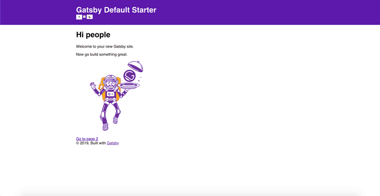
To view the work we have created we must import it. Generally the header is kept within every page in a website and not stuck to just 1 page. Because of that, we want to import our toggle switcher in the header component to allow users to switch between dark mode and light mode no matter which page they are in. After doing that, this is what your page should look like:

Creating the SCSS file
That doesn't look so good and it doesn't work. The reason it doesn't work is because we need to style the page when it hits dark mode or light mode.
10.) Creating a styles folder
To style it we need to create a SCSS file but before that, lets create a styles folder. The styles folder is where we will put all of our style sheets and we will create that folder under the src folder.
11.) Changing some files under the components folder
If you look under the components folder, there is a stylesheet called layout.css. Let's rename it to layout.scss and move it to the styles folder. When you do that you should get an error. And that is because, that file is being imported from the layout.js file. So let's head over there and change the import. Lets change it to:
import "../styles/layout.scss"
And that should remove the error. Before moving on, let's head to the header.js. In this file, lets remove the inline styling of the header. The header will no longer be purple when you do so but that's fine, we'll be changing the color later. Now let's move on.
12.) Clean up the SCSS file
This part is completely optional. If you took a look at this file, you'll see a bunch of css code, over 600 lines of code to be more exact. Let's remove all of the lines of code under the body. This will only slightly change the look of the website. If you want to leave it for whatever reason, then by all means you can leave it. I don't think it'll make a whole a lot of difference if you do and you may still be able to follow along.
13.) Let's make dark mode and light mode work
First let's style the header. Lets style it to a bright color, in my case I made it yellow. Then we're going to target the body in light mode and in dark mode. This will allow us to adjust the color of the webpage when you toggle to dark mode or light mode. I'll give you a code snippet of how that would look:
body.light-mode {
  background-color: rgba(228, 221, 193, 0.65);
  color: rgb(24, 33, 58);
  transition: background-color 1s ease;
}

body.dark-mode {
  background-color: rgb(24, 33, 58);
  color: rgba(197, 183, 183, 0.65);

  header {
    background-color: #035ec0;
  }
}
Feel free to change the colors of however you want it to look. And also once you add in those lines of code, your dark mode toggler is now fully functional. You can toggle between dark mode and light mode whenever you click on the checkbox.
14.) Style the toggler
If you don't like the look of the toggler, then I'll just give you the styling code to change how it looks. Feel free to just use it for yourself, make some modifications or just find some other toggler designs you can use. But here it is:
.toggle-icons {
  display: flex;
  margin-top: 10px;
}

button {
  font-size: 1.2em;
}

#sun {
  background-color: rgb(238, 238, 22);
  border: 1px solid rgb(238, 238, 22);
  color: black;
  border-radius: 50%;
}

#moon {
  background-color: rgb(17, 17, 119);
  border: 1px solid rgb(17, 17, 119);
  color: white;

}

.toggle-control {
  position: relative;
  padding: 0 4px;
  display: flex;
  align-items: center;
  margin-left: 4px;
}

input[type='checkbox'].dmcheck {
  width: 60px;
  height: 10px;
  background: rgb(27, 25, 25);
  position: relative;
  border-radius: 4px;
  -webkit-appearance: none;
  -moz-appearance: none;
  appearance: none;
  cursor: pointer;
  vertical-align: 2px;
  outline: none;

  &:checked + label {
    left: 55px;
  }

  & + label {
    display: inline-block;
    width: 15px;
    height: 15px;
    border-radius: 50%;
    transition: all 0.5s ease;
    cursor: pointer;
    position: absolute;
    left: 2px;
    background-color: #ffffff;
  }
}
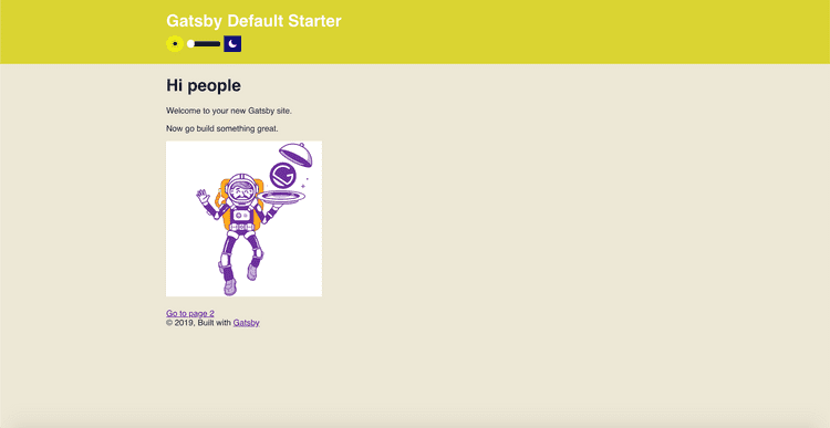
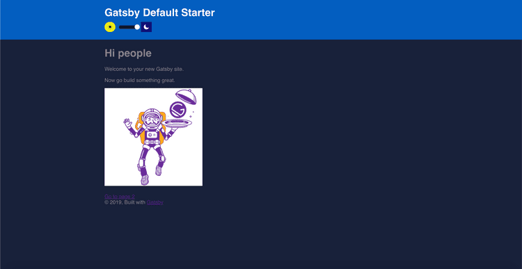
This is how your gatsby page should look after you have followed all those steps:


Completed
Congratulations! You just incorporated dark mode to your webpage. Though this was all done in Gatsby.js, you can also do this in React.js. By doing it in React.js, just skip the pre-requisites except for downloading Node.js because your really need that. Ignore the quick start and instead run this in the terminal npm install use-dark-mode. You don't have to configure anything in React.js.
Once that's done, just follow through with the rest of the blog, you won't be able to follow it exactly but it should be very similar. If you are familiar with React.js, you will be able to do it because a big part of Gatsby.js is knowing how to use React.js.
Thank you for reading this blog and visit my github repo on Dark Mode, which is more straightforward and it can be forked and cloned: https://github.com/sfahadh/Gatsby-DarkTheme